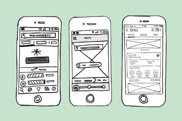
What is the difference between a sketch, a wireframe, and a prototype? Is a prototype and a mockup the same thing? These questions often arise when talking about UX/UI design, and there is nothing shameful about asking them. In this post, let’s dig in and clarify once and for all, what exactly each one of these entities is.

Who prepares app sketches and prototypes
The person responsible for designing wireframes and mockups of an app is called a UI/UX designer. It can be an individual specialist or a web design agency. They study the user’s behavior, build roadmaps, and visualize the mobile app interfaces.
UI designers think through effective layouts and dashboards that could guarantee to the users the most convenient and satisfactory experience using the app. Among other things that can be useful for such a professional to know are content marketing strategies and lead generation funnel principles, psychology, project management, and technology.
Perks of visualization
If you are wondering whether you need to go through all the stages of UX/UI app design or you can skip them, consider the following:
- If you decide to invest in the app’s prototyping, it will allow you to keep track of how the team of designers is realizing your business idea in real-time before it’s too late to correct everything.
- It will also aid you in evaluating whether some features of functionality need to be introduced to the initial plan for more efficient interactions with the user.
- You will have a clear vision of your product right from the beginning and can use your app prototype to show to the sponsors and get funding.
- You can test the application concept first, and then get started with coding and deployment.
Receipt of a perfect sketch
Sketching the interface of the future app is the first step for every professional web design agency. It’s done by hand with a pencil or pen on paper or in a particular app – whatever tool the designer finds most convenient. The sketch is usually fast and easy to make, and help both fix and maintain the idea in question. Brainstorms often use it. There are no rules on how to sketch an app idea – it can even be done on a napkin with red lipstick, as long as it reflects the designer’s intention.
When preparing a sketch, the designer can outline some details of the interface and mark its functionality. But you don’t need to get carried away and draw out all of the details.
Sketches aren’t meant to be shown to the client or investor. While they’re a great way to convey ideas from the heads of designers to other team members, the clients are unlikely to understand a sophisticated app interface idea from just a couple of lines. It can raise tension and lots of objections at the early stages of UX/UI development. It’s better to develop a wireframe or prototype and use it to communicate the idea to the owner of the project.
What is a wireframe
Designers prepare the wireframe after the sketching phase is complete. The designer has already discussed their ideas with the team and starts to make a black and white detailed layout of the app interface.
Wireframes are the outline of the full functionality of the final product. They already take into consideration the layout of the elements: buttons, images, microcopy. However, wireframes don’t use typography, color schemes, or any other graphic design elements since the focus is on functionality, behavior, and content. They focus on the interaction between screens, rather than on how they look. It can be compared with preparing a construction plan for a new building- the team will stick to the timeline during the development process. It determines where you will locate the content and how the app is going to look in terms of elements and font sizes.
However, it’s not the last stage of UX/UI planning. For example, it doesn’t show any animation, so it’s impossible to imagine any real app functions just by looking on a wireframe. So, all the remarks about interactions, chips, animations are described additionally in the comments.
Mockup VS Prototype: what’s the difference
A mockup is a more refined version of the wireframe. The designer adds colors, selects images, and the typography is already thought out. The mockup shows how exactly the application is going to look. This model reflects the style and mood of the project. Here, the coordination with the customer is highly desirable, so that the development team can come to a consensus with the client before the production stage.
Note: By a mockup, professionals understand a model that imitates the user journey in the exploration of the product. It can also describe how the user will carry out the target action like “make a purchase,” “contact us,” or “subscribe.” So, in this scenario, a mockup has nothing to do with the layouts. It’s more like a guide for copywriters and marketers based on user experience aimed at helping to increase sales and profit.
A mockup or a prototype?
In some UX/UI design companies, they also distinguish between mockups and prototypes. A prototype is a clickable model of the future app. It can be black and white or already in color. Prototypes enable clients to see how the user is going to interact with the app, and companies can use them as a presentation to sponsors. Also, prototypes are applied to test the usability of the UX/UI design.
However, some designers see no difference between mockups and prototypes and use these words as synonyms.
Summing up
UX/UI design is a process that consists of multiple stages and demands efficient collaboration between team members and the client. Sketches, wireframes, and prototypes help organize this workflow and deliver the most satisfactory results.


