In today’s world of smartphones, tablets, cell phones, and laptops, everyone is seemingly wired to the Internet. While the proliferation of communicative devices offers several benefits, every website wasn’t designed for every device. As a result, some websites would load perfectly on a laptop, but fail to offer an acceptable user experience on the tablet.
As a solution to the previously stated problem, themes with responsive design result in the creation of web pages that implements an inherent level of device flexibility. By using flexible layouts, cascading style sheet Media Queries, and flexible images, the website actually responds to fit the viewers screen.
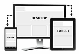
Themes with a responsive web design offer different formatting and layout options based on the viewing device. Instead of the HTML mark up dictating the style, the browser actually indicates the most appropriate style on page load, which frees website owners from having to manage different sets of pages for each display screen. While there are several templates available, the following 7 tips for developing a theme with responsive design are for the do-it-yourselfer.
Less May Be More
When developing a theme with a responsive design, it’s important to consider the size of the theme. Larger themes cause significant delays for the web server and for the end user. Servers are slowed because they require additional time to grab each additional file, which quickly adds up. As a result, if your theme is too large, visitors may not be willing to wait and simply leave.
Use Adaptive Images
When working with a responsive design, the images must be fluid to scale to fit both the text size the viewpoint. As a solution, Adaptive Images implement one php file, one htaccess file, and one line of JavaScript to assess the screen size of the viewer. Then it caches, creates, and presents the image as a device-appropriate picture. It’s still important to consider what the images will look like when it’s scaled down.
Practice Minification
After you have designed an elaborate responsive theme, you should always practice performance optimization. The object is to reduce the loading time and reduce the number of HTTP requests. The process of minification involves taking all of the unneeded characters from your code without affecting the functionality of the page. The overall objective of minification is to reduce the size of the page and bolster load times. This can also you to make your code as strong as possible by removing any possible weak links. Taking a cyber security training may help you to understand just how easy it is to crack coding and why trimming excess code can make your site stronger.
Understand Menus
Considering the width of the navigation area is affected by the number of items and length of your navigation labels, your navigation bar can look different on different devices. One of common outcomes is a broken navigation bar on narrow mobile screens. Even though the theme looks amazing on your laptop, you should attempt to imagine it on a mobile device or smartphone.
Video Handling
You should also pay attention to how the theme handles videos. In responsive designs, videos can present a few different problems deriving from the nature of embedding. To accurately accommodate video resizing, special HTML markup must be used. If you ask the author of the theme whether it can handle video content, you will develop a much greater understanding.
Advertising
Since ad serving systems generally do not provide optimized content for multiple devices, advertising with a responsive design can be overwhelming. In addition, ads have typically been served with iFrames and JavaScript tags, which cause formatting issues. If you plan to serve ads, you should have a strategy explaining how you will either serve alternate ads for mobile devices or turn on/off ads at different sizes.
Supported Resolutions
When the viewing device’s screen resolution is below a certain number of pixels, responsive designs employ Media Queries to reformat the design. As a viewing option, you can use the browser’s Resizer tool to set your desktop browser window to test a few of the common device sizes. By viewing the theme with the resizer tool, you will preemptively notice any oddities.