According to Internet Live Stats, there are more than 1.7 billion sites in the world by now. Every second, 10 new websites join the list.
Surviving on the web is getting harder. Therefore, the new web-design directions appear that allow you to have an advantage in the market.

Let’s see what brightest web design trends of 2019 are worth paying attention to when creating your website.
1. Personalized UX
Today, approximately 45% of companies make content on the homepage personalized.
Thanks to artificial intelligence, the user experience has become personalized. Now, using it, it is easier to solve the main task: making each user a privileged client, offering him the services that he really needs. A good illustration of using AI is website builders (for example, Weblium AI website builder of the fifth generation: https://weblium.com).
With UI/UX personalization, you can achieve a high level of communication with the brand. It also makes site navigation more convenient. Thus, the personalization of the system interface increases usability.
As a result, the client receives a higher level of satisfaction from interacting with the site, which increases sales.
2. Content Oriented UX
Customer-oriented content takes into account the needs of the end-user.
A website today is much more than just visual appeal and functionality. Now the content has become a determining factor, which one way or another, affects the user’s decision.
Content in tandem with UX can make the right momentum, which is so necessary for creating a successful web design.
3. Minimalism and catchy design
These days, end-users prefer minimalist, clean and attractive websites, as they help focus on the most important, rather than being distracted by multiple minor details.
On the other hand, a minimalist, clean and dynamic website, supplemented with the bold fonts, where appropriate, helps the user very quickly access the information he needs without much effort.

Thus, the negative space is considered the main feature of the minimalist site design.
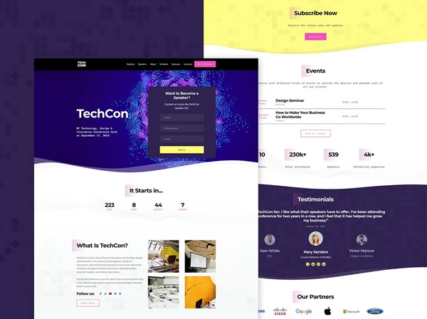
4. Rich color schemes
Rich color schemes with high-end visual appeal effortlessly attract the user’s attention.
This not only enhances the aesthetics and visual appeal of the website but also improves the interface, providing the most comfortable user experience.
A website with vibrant hues of saturated colors attracts more users!
5. Augmented Reality
AR helps the user easily visualize and feel the creativity of the imagination. This allows you to better understand and satisfy end users in many ways, giving them the power of imagination.
This would be useful for enterprises that use imagination and creativity, allowing them to easily demonstrate their ideas to the client right on the website.
6. CSS3 animation
CSS3 is the latest evolutionary change to CSS. It introduced some cool animations, such as rising and falling using rotation, time delay, iteration (repetition), movement in a given direction. These CSS3 animations can make your site look softer, giving it a futuristic and sci-fi look.
Such visual effects not only attract the user, but also create modern website’s individuality, make it visually attractive, and set it as a separate class.
7. Sticky items
Sticky items remain visible when scrolling. This allows the user to see important information all the time within reach even when scrolling through various parts of the page.
Using the sticky navigation bar helps the user navigate at any given time without scrolling back to the top of the page.
8. Progress bar
Many sites (most often the e-commerce sites) use a scale that shows visitor’s progress. It helps the user to see the number of actions that need to be fulfilled and allows him to estimate the time required to complete a certain operation.
If a website offers to perform multi-step procedures, then a progress bar is a must-have element!