Landing pages are magnificent promotional tools, especially for targeted products. Against using homepages, which clearly outlines a more general purpose, landing pages increase conversion, because it completely removes distraction from a prospect. To supplement, landing pages are exceptional for offering free goodies, value, and convert visitors into leads.

Many businesses shy away from using landing pages because they’re clueless as to how to set it up. Looking for pointers on how to create a powerful landing page design? Here are 10 suggestions to follow.
1. Length of landing page
Landing page lengths vary since short and long pages have both shown results. The trick is deciding on what length you want to use. However, it’s recommended that you use short, non-scrolling landing pages for simple and uncomplicated product offers. The reverse applies for complex product offers.
2. A killer headline
A killer headline has four objectives: grab the visitor’s attention, engage them, boost their interest, and get them to use the CTA (Call To Action) button.
3. Sell value and benefits, not the product
Your product is great! That’s awesome. However, your visitors don’t care. They want to know what’s in it for them – how they benefit from using your product. Don’t sell the features of your product. Rather, sell its value and benefits.
4. Offer incentive
Who doesn’t love the idea of getting free value-packed goodies? People are particularly skeptical about providing their personal details to someone they’ve never been acquainted with. Incentives boost desires. Give them something of value, in exchange for what you want. How about a free PDF on how to design effective landing pages? Whatever the incentive, it should move your visitors to act.
5. Strong call to action
You might be a little apprehensive at this level, but telling your visitors what you want them to do is very important. For better conversions, include your call to action above the fold. It’s quite rare that visitors scroll all the way to the button, so ensure to include the good stuff above the fold.
6. A/B testing

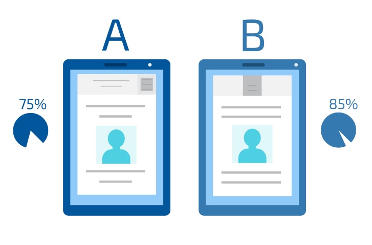
Perform an A/B test to determine what works best. This can be done with the colors used, call-to-action,images and graphics. Make your comparisons and see what your visitors engage with.
7. Provide social proof
Your visitors won’t just take your word for it. Provide evidence of your claims. Have you recently received testimonials? Use that to establish trust. What about certificates and symbols? Has any famous company used your product? Providing social proof heightens confidence and kills skepticism.
8. Use short forms
Unless necessary, use short forms. If your visitors have to populate a form with 21 fields, they’ll be turned off and will not follow through.
9. Embrace social sharing

The aim of your landing page is to promote a targeted product. Encourage your visitors to share your offer to those who might be interested. Use social sharing plugins to accomplish this.
10. Get rid of your main navigation
A smart way to remove distractions is to get rid of your main navigation. You want to focus your visitor’s attention on the issue at hand. You don’t want them clicking to other areas of your website.
When created properly, a landing page can produce great results. Use those ten (10) tips to get your promotional tool in full gear and create an awesome landing page.