A lot of web developers and designers underestimate the intricacy of form building. Sure, there are plenty of cloud-based tools out there that will help you create fully-functional forms within minutes. But without a strategy in place, forms can be underwhelming, frustrating, or simply ineffective in accomplishing your business objectives-effectively wasting the time, effort, and money you invest in their development.
Despite having access to the latest design tools, a lot of beginners are prone to form building mistakes. So if you want to build successful forms, then you need to learn from the examples of brands that did it right.
Here are some of the best form examples and the practices you need to replicate their success:
Sometimes, you can’t help but require a lot of information for a successful online transaction. However, users make mistakes and it can be tedious for them to refill all the entries just because they made an error. Pinterest’s elegant solution is to validate information as they are being typed in by users; notifying them whenever an error is made. You can see this feature being implemented in a lot of forms, particularly registration and order forms that take a lot of time to complete.
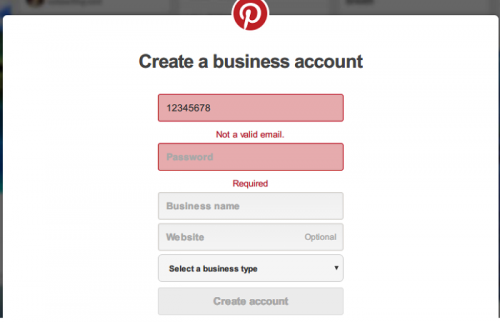
TL; DR: Help your users make the correct inputs by validating information as they type.
In signup forms, you need to encourage your audience to use strong passwords for their own security. You often see this in big names that prioritize customer experience like Google. Sure, users may ignore your indication, but at least you did your part in reminding them to practice basic account safety.
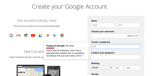
TL; DR: Discourage your users from using “weak” passwords with a password strength indicator.
Kickstarter
Sometimes, input errors made by users are not so easy to spot. For example, a typo in the user’s email address can be easy to overlook without a prompt notification. To improve user experience, you can pinpoint common spelling errors and offer corrections-like what Kickstarter did with their registration form. With a little creativity, you can use spelling suggestions in other fields like user and location names.
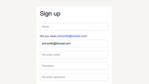
TL; DR: The online audience appreciates any form of help, and they will trust you more for it.
GitHub
When it comes to payment forms, you must consider even the smallest feature that will add convenience. Github’s take is to automatically recognize the type of payment card being used as the user types the digits. If you want your customers to value your services, then you should also learn to value their time.
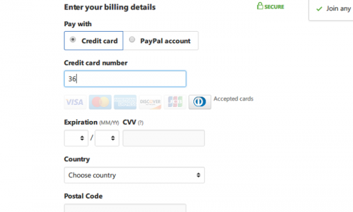
TL; DR: Tweak your forms to automatically identify the type of information to save your customers’ time.
Samsung
If you want to provide great customer support, then you need to offer solutions as fast as possible. For example, asking users to upload attachments in a contact form is a big time-saver if you require details such as the date of purchase or actual product photos. Samsung understands this well and offers a simple upload feature in their contact form. Like a lot of features highlighted in this article, you don’t really need excessive coding to enable attachments in your forms. There are plenty of WordPress contact form plugins that enable attachments for those with little to no coding experience.
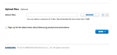
TL; DR: Enabling attachments in contact forms save a lot of time by including more information in a single message.
Asking your users to fulfill a registration form is already too much to ask. It costs nothing to be a little helpful and provide them with the necessary instructions to go complete the process as quickly as possible. Facebook, for example, offered thorough guidance throughout their registration form. Although they’re already a popular and trusted brand, they still prioritized a seamless user experience by requesting only essential contact information.
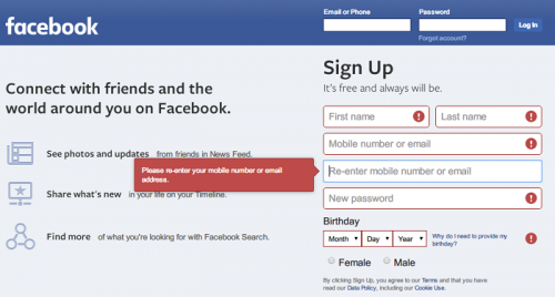
TL; DR: Give clear instructions and prefill forms if necessary to guide your users.
Best Buy
When it comes to online purchases, a lot of ecommerce websites overlook the importance of creating a well-optimized mobile checkout page. Keep in mind that a growing number of users now prefer a mobile device for online browsing. To increase conversions, you need to create an interface tailored to the smaller screens of smartphones. Best Buy knows this and implements responsive design for their checkout forms.
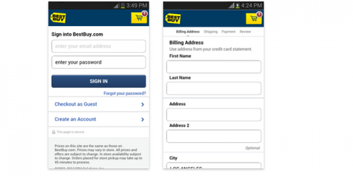
TL; DR: You need to implement responsive forms to cater to your mobile audience.
Rockstar Games
A lot of online brands capitalize the growth of social media to make the registration and login process a lot easier for new users. For example, instead of manually filling in a name, email address, or any other login credential, users may choose to sign up with their social media accounts to automatically supply these information. Rockstar Games is one of the adopters of this strategy. It is a win-win strategy since users enjoy a speedy registration/login while brands generate new social followers in the process.
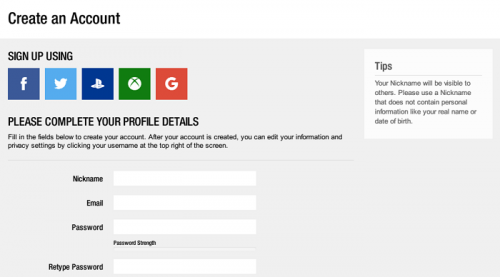
TL; DR: You can easily use social login plugins to make signups/logins easier for your audience.