Designing and developing a website used to be simple. There was a time when you could go to a developer and ask for a three column website with a nav bar above the content, and what was delivered was exactly what you wanted. Those times aren’t completely gone, just look at anyone’s portfolio site for some evidence of the trend, but business sites have moved beyond this level of simplicity. At least at the top level.
Simple won’t solve all of your problems, but thoughtful design will. Before you begin working out the specifics of your website, make sure that you’ve carefully examined these issues and come up with ways to solve them.
User Interface
The Interface is perhaps the most important part of the website. A good UI teaches your customers how to use the rest of the website, and provides a solution to the customer’s problem. Users crave simplicity here, so much thought is often needed to spec out a design that is intuitive and user friendly.
Consistency is extremely important, especially above the fold. Lists are a good example of this in play, where the same amount of clicks should always lead to the same destination. This is one reason why developers employ breadcrumbs.
Facebook is the best example of UI in flux. It changes constantly in order to present certain information to users above all else. Sometimes it may be a news story, or it may be gifs or videos that automatically play as the user scrolls. The page was once quite cluttered, but it does a decent job of teaching the user what to do pretty quickly today.
Integration
Integration can mean moving new code into your existing database, carefully testing every function as things are deployed, but it also has another meaning. It can refer to the services you use with your website. Social media is a good example, where too much emphasis has led to spammed sharing buttons on blogs and websites. In some cases, those social buttons actually block content and prevent the user from consuming it.
Wikipedia is the best example of an integration nightmare. So many users edit its content, and sections don’t change over time as they become cemented knowledge. That leaves a lot of broken links and typos all across the page.
Accessibility
The accessibility of your website refers to how easy it is for the user to find exactly what he wants. If we think about accessibility comprehensively, we begin to see the necessity for things like SEO. SEO does help a website rank better for a particular term, but the often understated benefit is the intense organizational process a website must go through to get there. It also covers your navigation and your footer, both of which should have important links and information handy. It’s a good idea to list contact details, and the most visited pages, in the navigation of both the top and bottom of the page.
Any government website pulls this off very well; featuring dropdowns that help the user get to what he needs without crowding his view of other things. The “survey” prompt is deployed thoughtfully and non-intrusively, and the site is well organized with a sitemap that points to every possible link.
Design
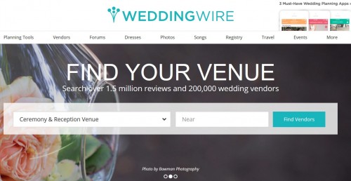
Above all, the site must cater to the user it hopes to attract. If it’s an eCommerce marketplace, it should list items by category. Take Wedding Wire as an example.

The site lets users search by what they need, say vendor or DJ, then allows them to narrow things down geographic area, guest capacity, venue setting, type of services offered and more. Something like this is preferable to the shotgun approach of Google, filling the niche of people looking for more than the most popular venues and entertainment. The site also employs an effective landing page that prominently asks the user what she wants, and where she is located.
Images and text, and the relation they share, are still extremely important to design. Images must not clash with text, and the text should be kept minimal except where warranted. For example, the landing page of your website is probably not the place you want to put a blog.
The easiest source of inspiration is to look at your peers, then try to present yourself. Study what makes their site successful, and try to emulate that in your own work.