Design is an evolving sphere as new tendencies appear and disappear each year. Today it’s hard to imagine a modern site using the “back-to-90s” design as our ideas and technical abilities have changed a lot since then. Today you are more likely to see flat design everywhere.
ECommerce sphere is not an exception, it quickly picks up all modern design trends to utilize them and get more customers. And here are some modern trends of eCommerce home pages design.
Home page as a product grid
This type of homepages looks like a catalog with most popular and recent offers which are organized in a grid. Such pages can also contain sliders. However, today many conversion rate optimizers treat sliders as “conversion killers” so many stores have stopped using them.
Product grid home pages are usually used by stores with large inventories or stores with many brands as they need to reflect many products at once.
Product pages built from grids are quite easy to edit (of course, it depends on the CMS you are using). Moreover, they provide important information and begin to sell once a customer lands there. However, if you want to stand out with your site, you need something else than a product grid home page.
Home page with custom design
Home page design can also be customized – that’s where a designer’s imagination comes into play. Such pages contain a few products or no products at all, attractive high-quality images and/or videos.
Different stylistic elements can be observed there: large topography, ghost buttons, hidden menus, etc. One-photo pages are usually used by mono-brand companies. The images featured on such custom designed home pages create positive emotions and brand image.
Examples of custom home pages
Now when you know about two main eCommerce home pages design trends, it’s time to see some great examples. I will focus on custom home pages represented by a single picture or parallax design.
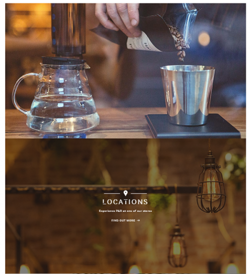
1. Pablo&Rusty’s
A screenshot can’t describe all the feelings you get when you visit their homepage. It tells the story of coffee before it appears in your cup.
An unusual parallax/animation effect is used there. Moreover, each picture contains a link to particular internal page where you can find the information you need.
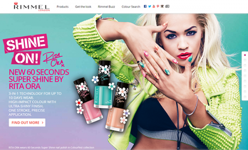
2. Rimmel
A great example of a home page with an interesting parallax affect which features different products.
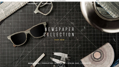
3. Shwoods
This is a perfect case of an informative and at the same time visually attractive homepage containing a beautiful image, one of the products, video and even latest posts.
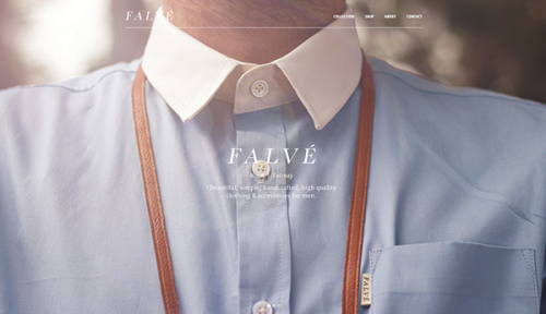
4. Falve
This Australian menwear brand is quite laconical at describing itself. But the description does its job.
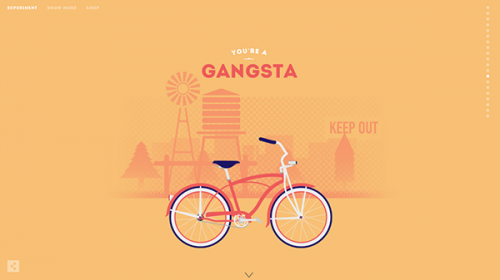
5. Cyclemon
Cyclemon has a wonderful example of a parallax home page which features their posters designs. Scroll down and have fun!
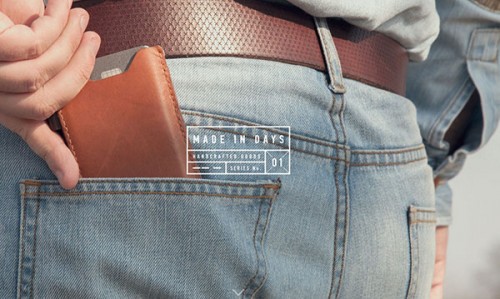
6. Made In Days
Here one can find great demonstration of products on a parallax home page. Even clickable elements (e.g. ghost buttons) have been made not so obvious not to distract users from the products.
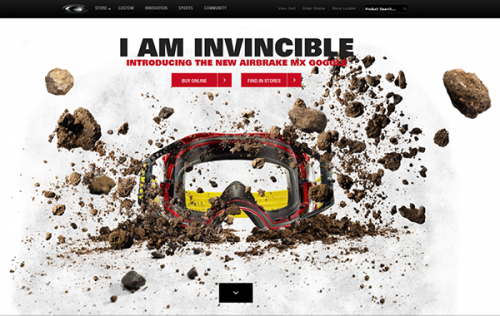
7. Oakley
Do you need goggles? If no, look at this page and think again. Ok, if you still don’t need them, you definitely won’t forget their homepage used to its most. The catching animation/parallax effects found there work to show each feature of the product.
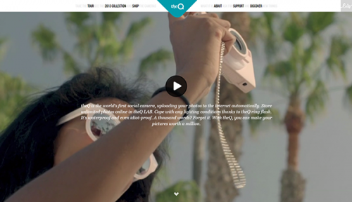
8. TheQ camera
Here is a good example of a video background. This is a cool trend that 100% matches the company niche.
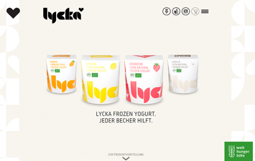
9. Lycka
Lycka’s home page doesn’t have fancy effects but looks light and attractive. It also has a heart which travels with you as you scroll down.
Decided to switch to a customized home page? Here are some tips
Though parallax home pages look good, creating them is quite hard and time-consuming. Moreover, it’s not always justified. So you can go for a simpler solution and create a single-picture home page. Here are some tips that will help you:
- Use only those images that have been specifically created for you.
- If you have a custom design home page, it doesn’t mean you should forget about mobile-friendliness. So make sure your home page looks good on mobile phones and tablets.
- Don’t overlap your cute image with text, buttons and other elements. You can hide menu or use ghost buttons instead. If you still need fancy site navigation, you can make it visible on your internal pages.
- Don’t let the image to mislead you customers. It should reflect the reality and be closely connected to your brand.
- Make sure that all the elements of your page (carousels, sliders, etc.) work fine on all devices and resolutions.
- Mind image sizes to find a balance between fast page load and good quality.